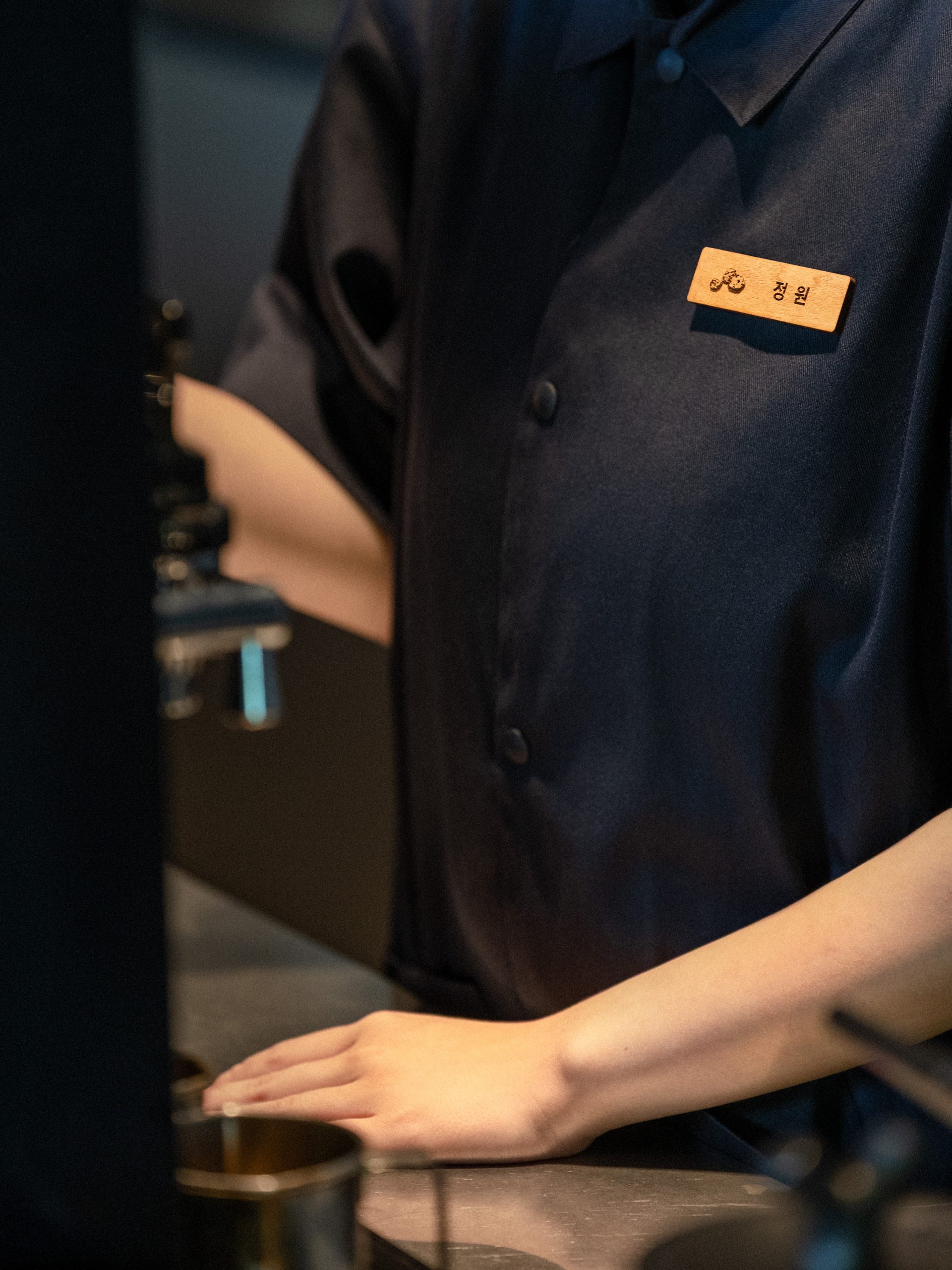
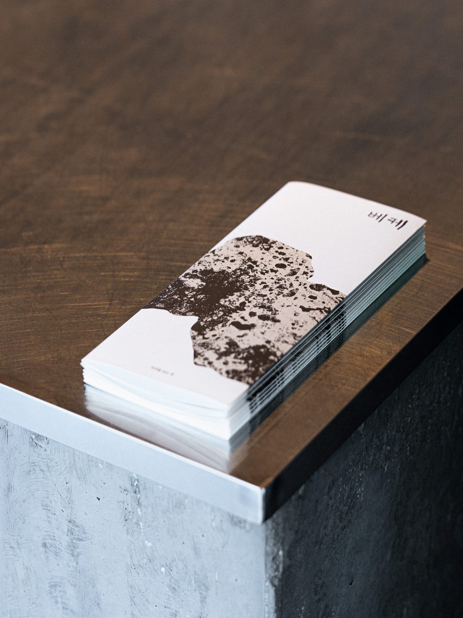
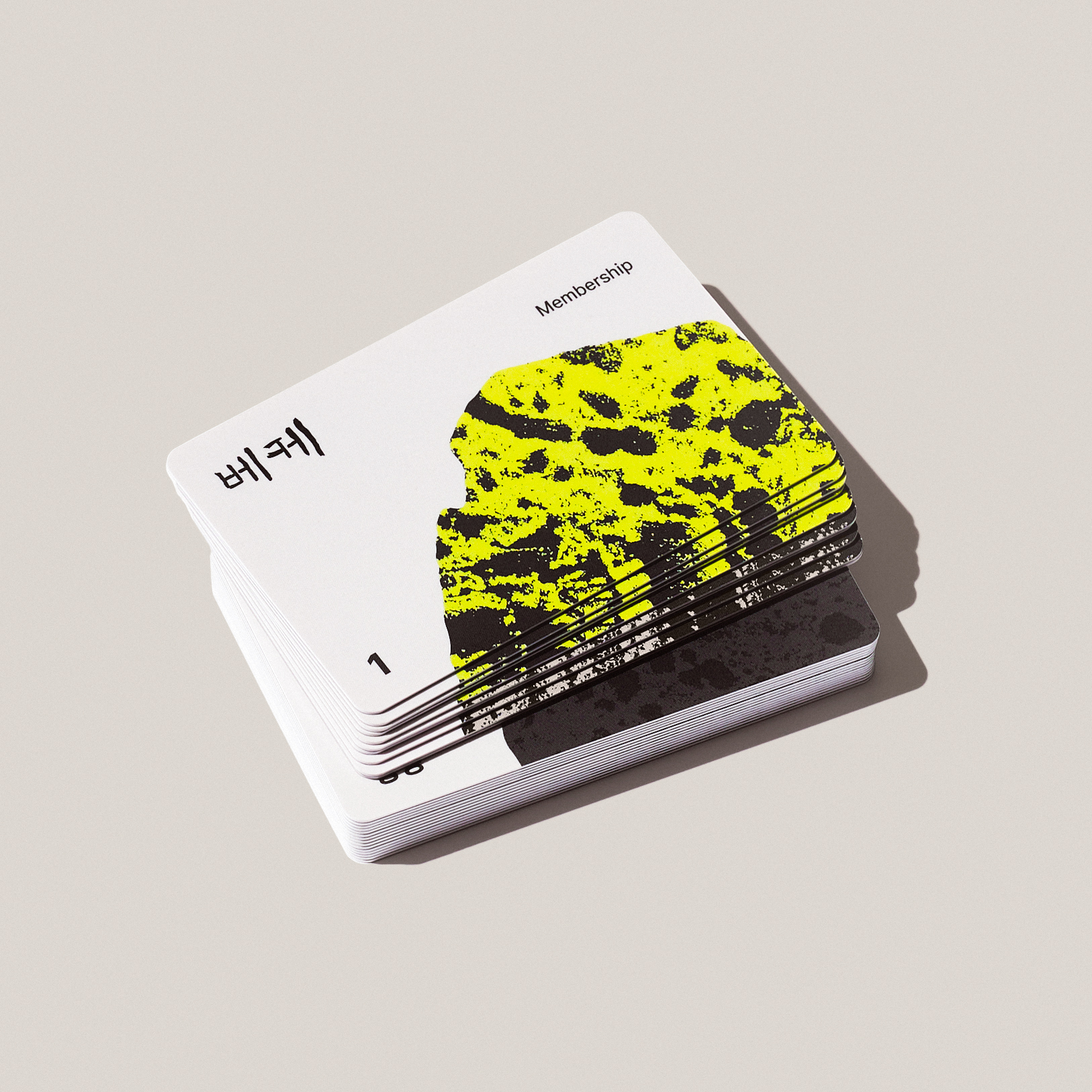
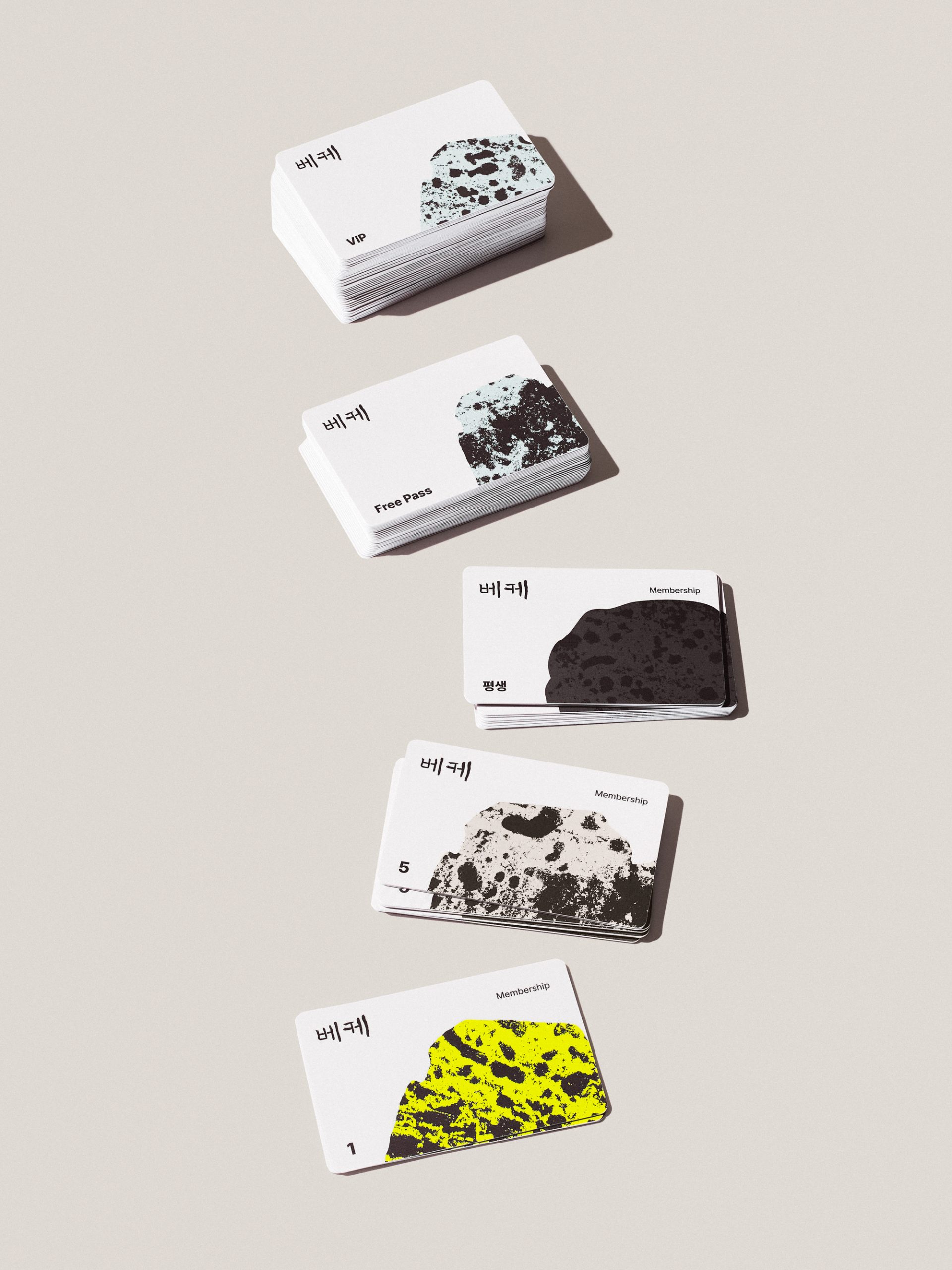
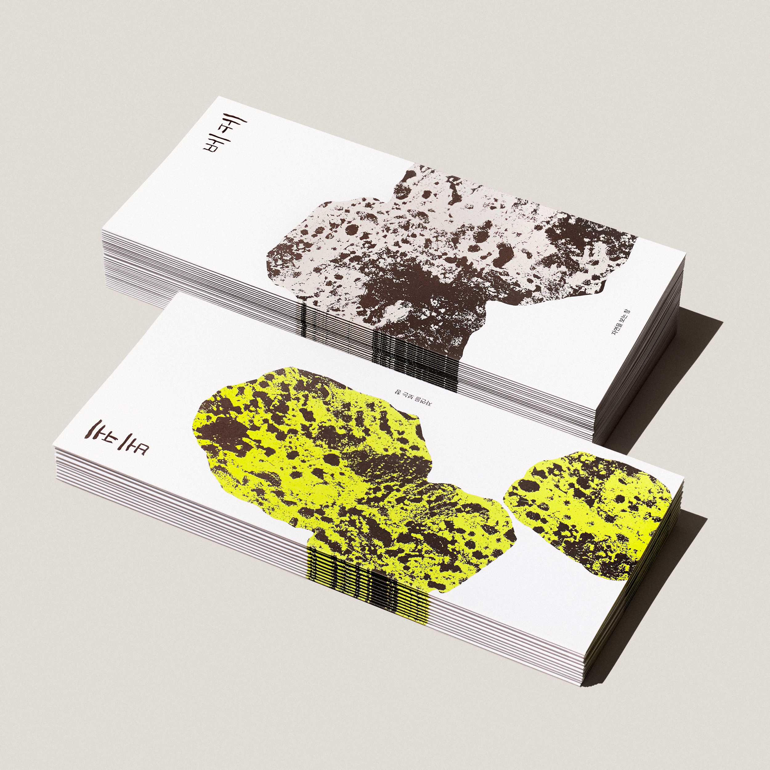
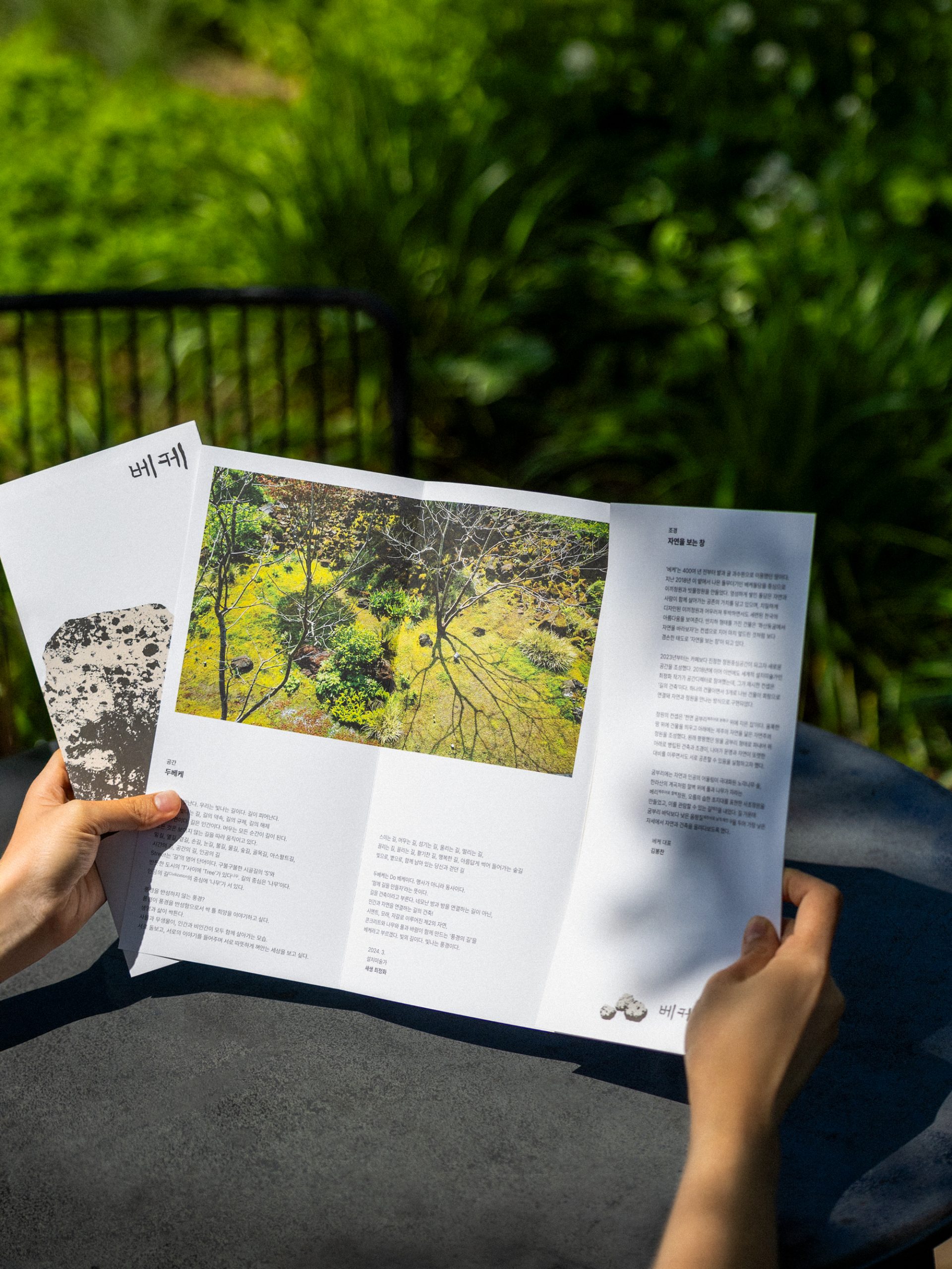
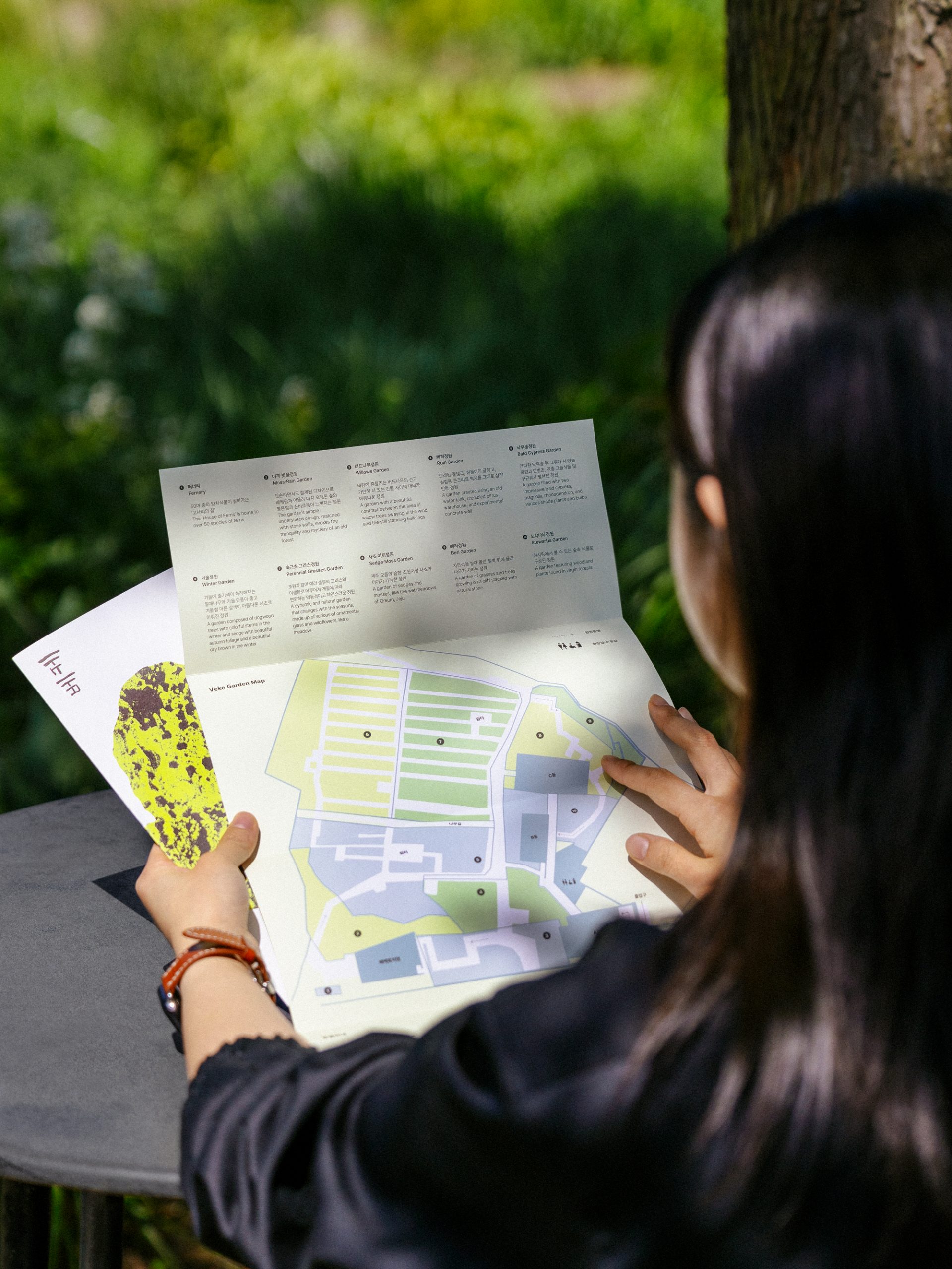
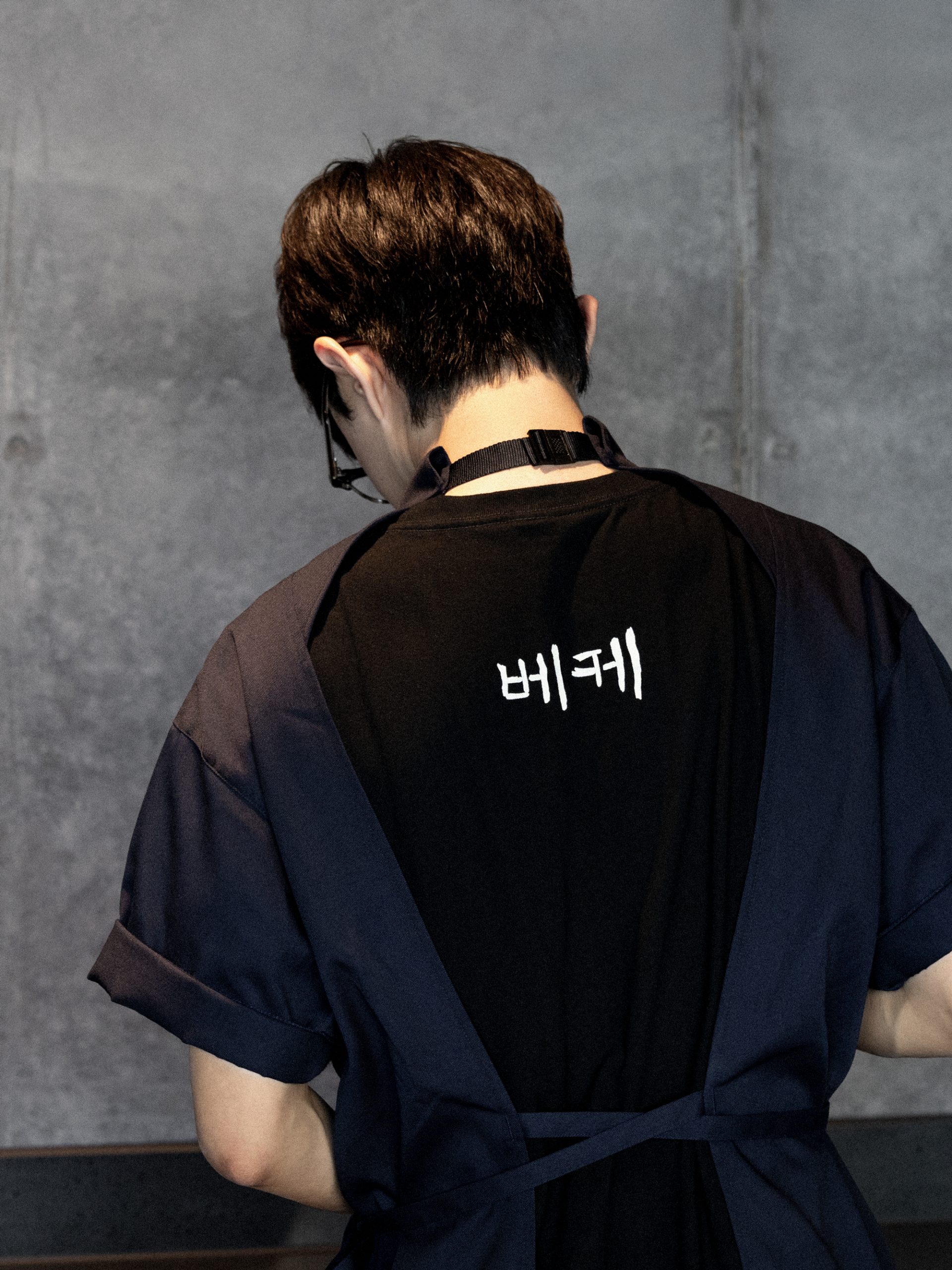
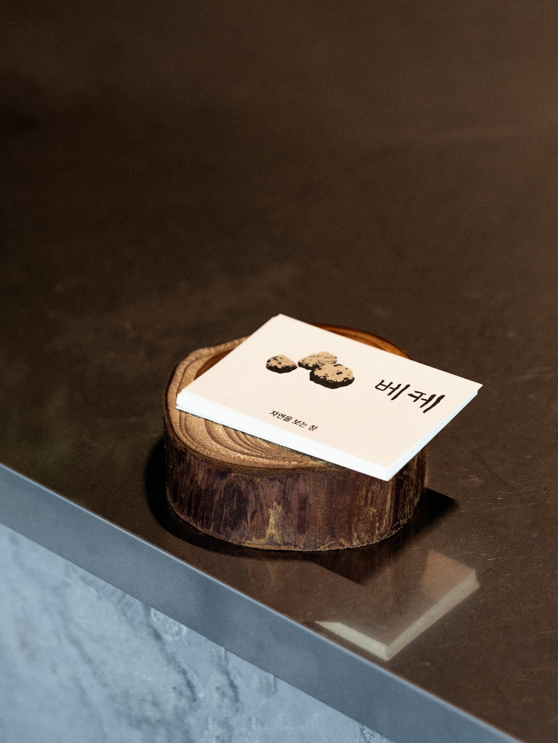
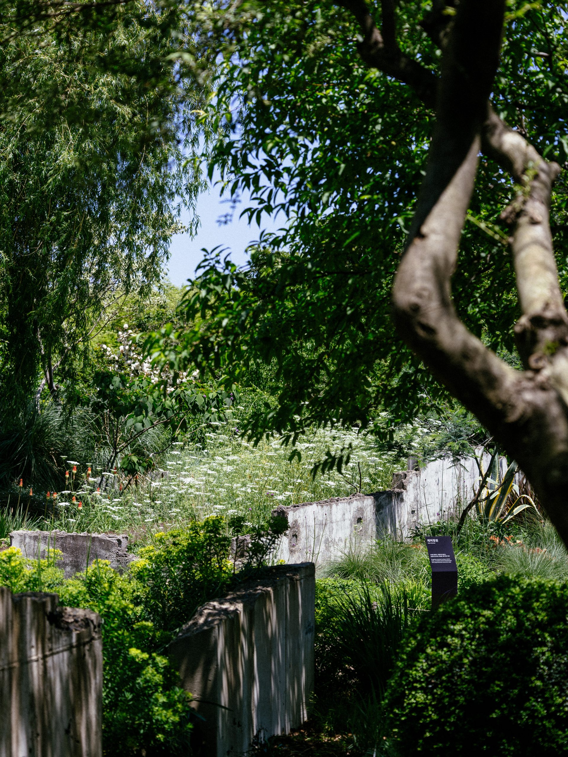
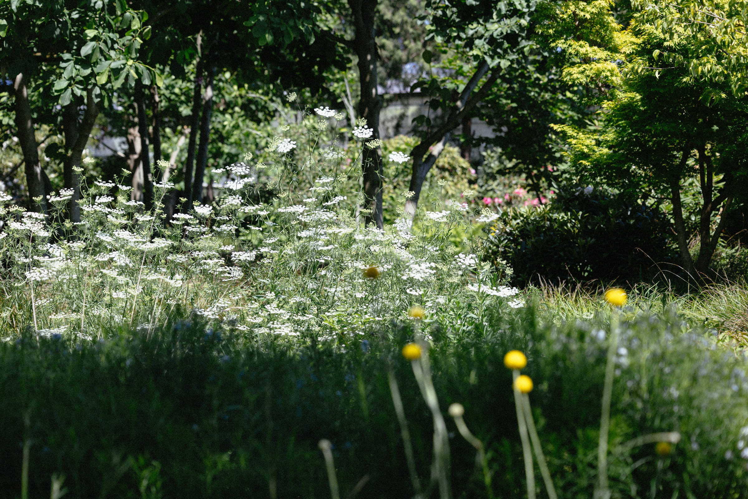
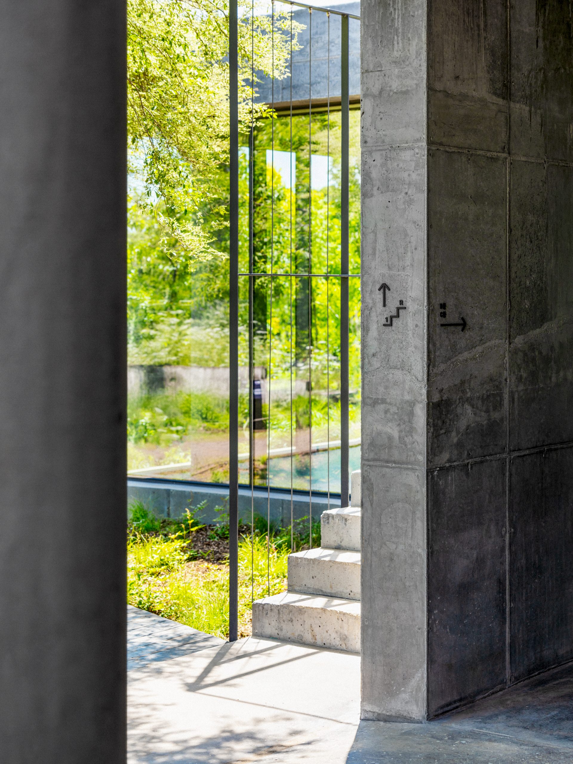
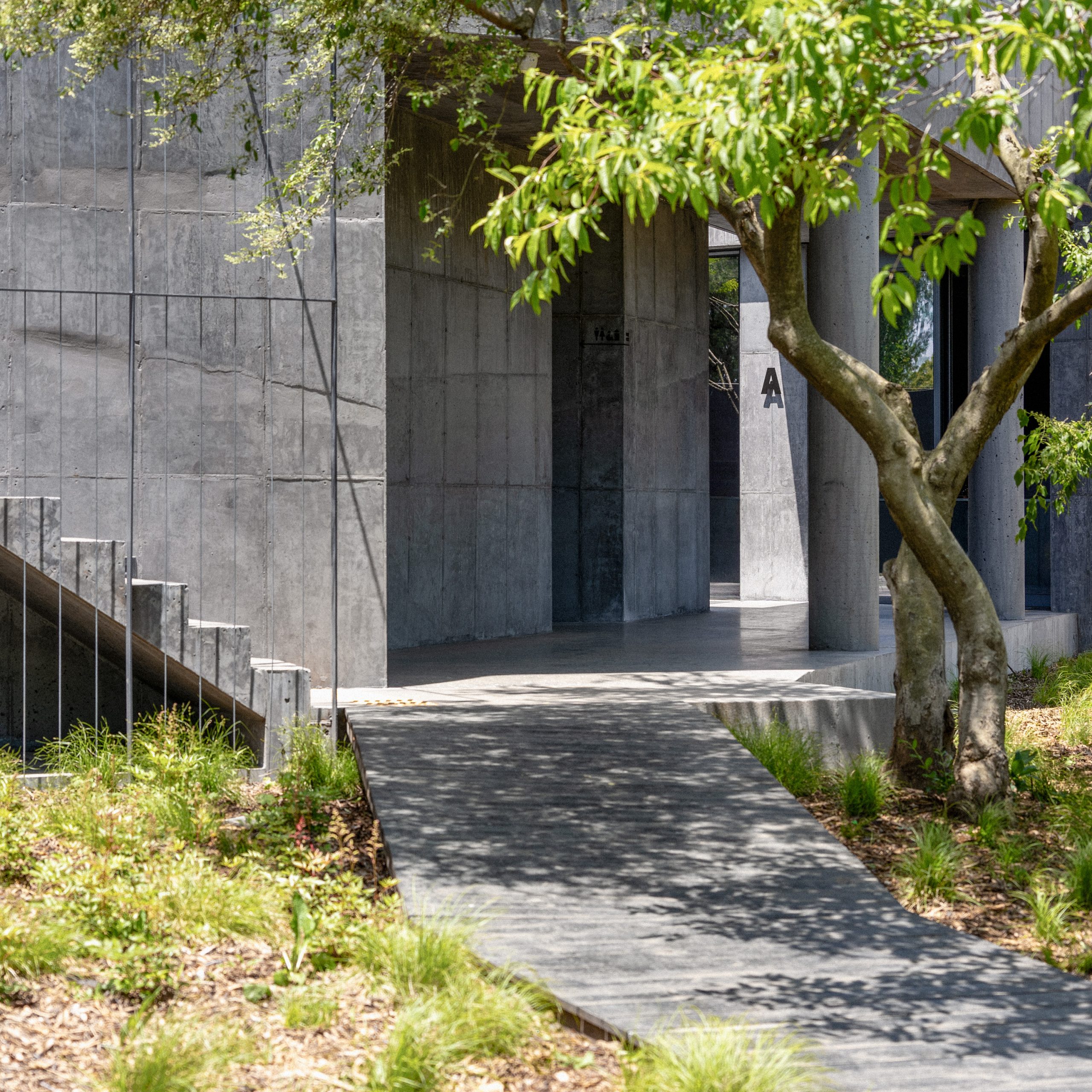
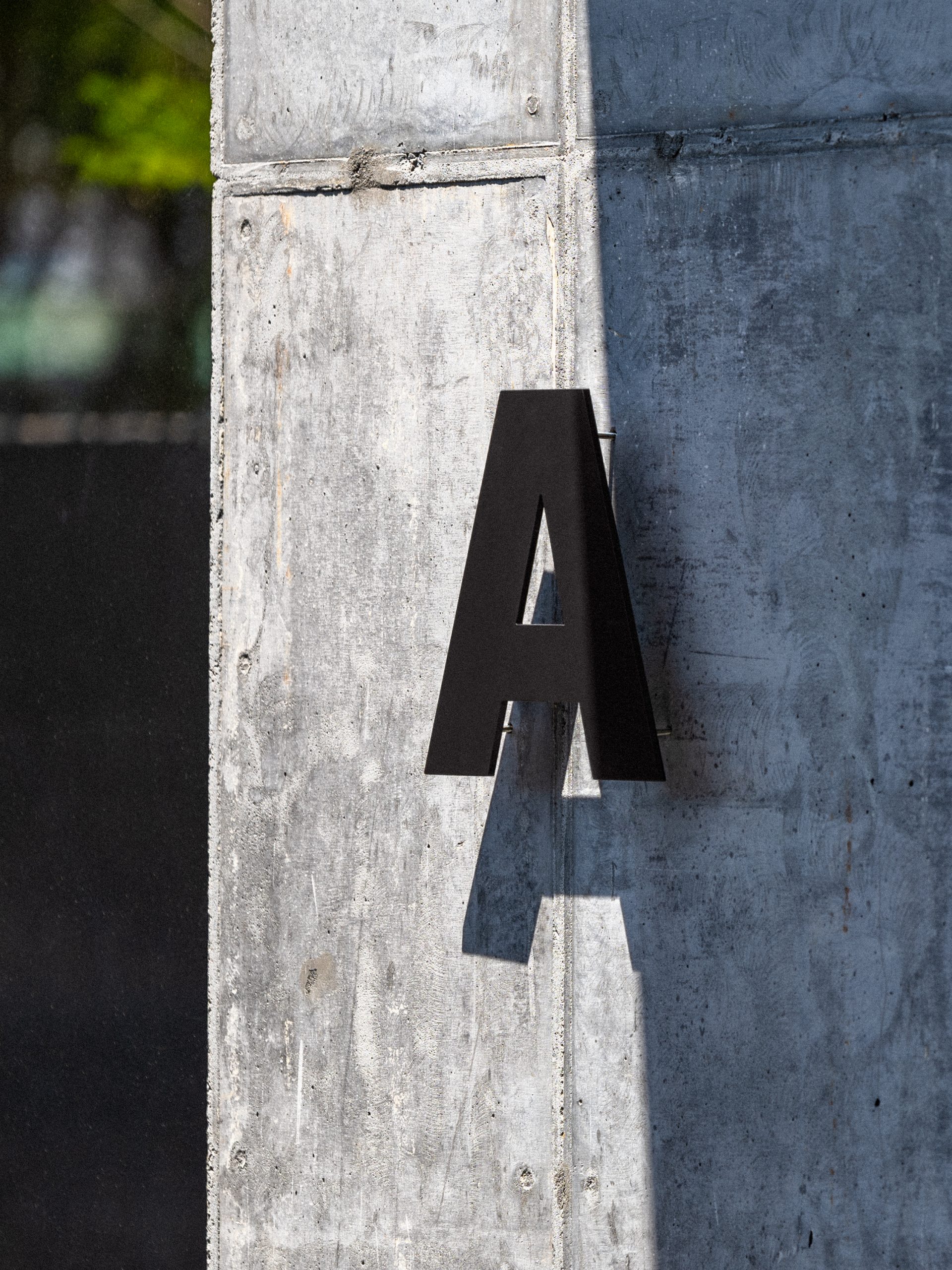
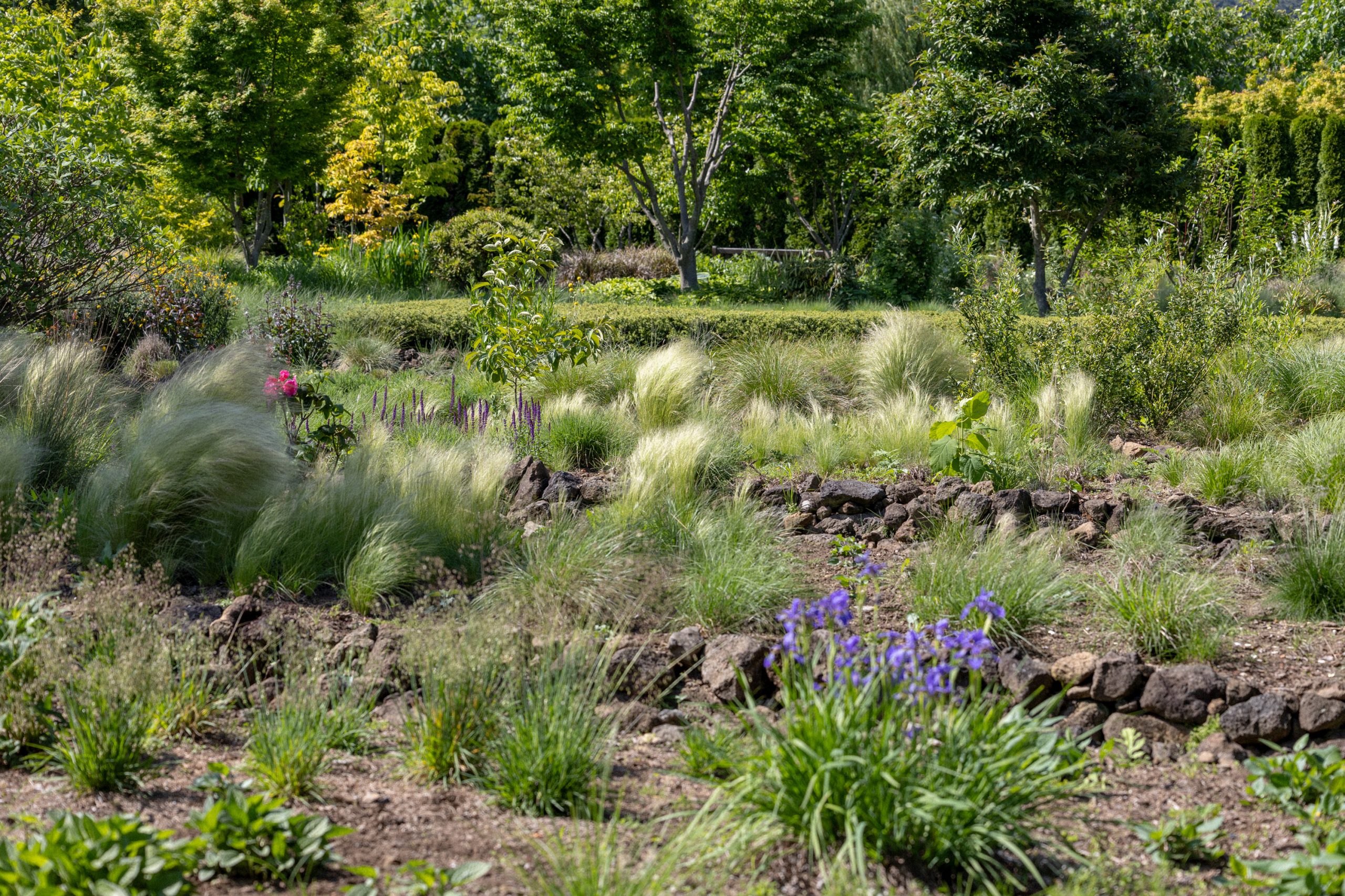
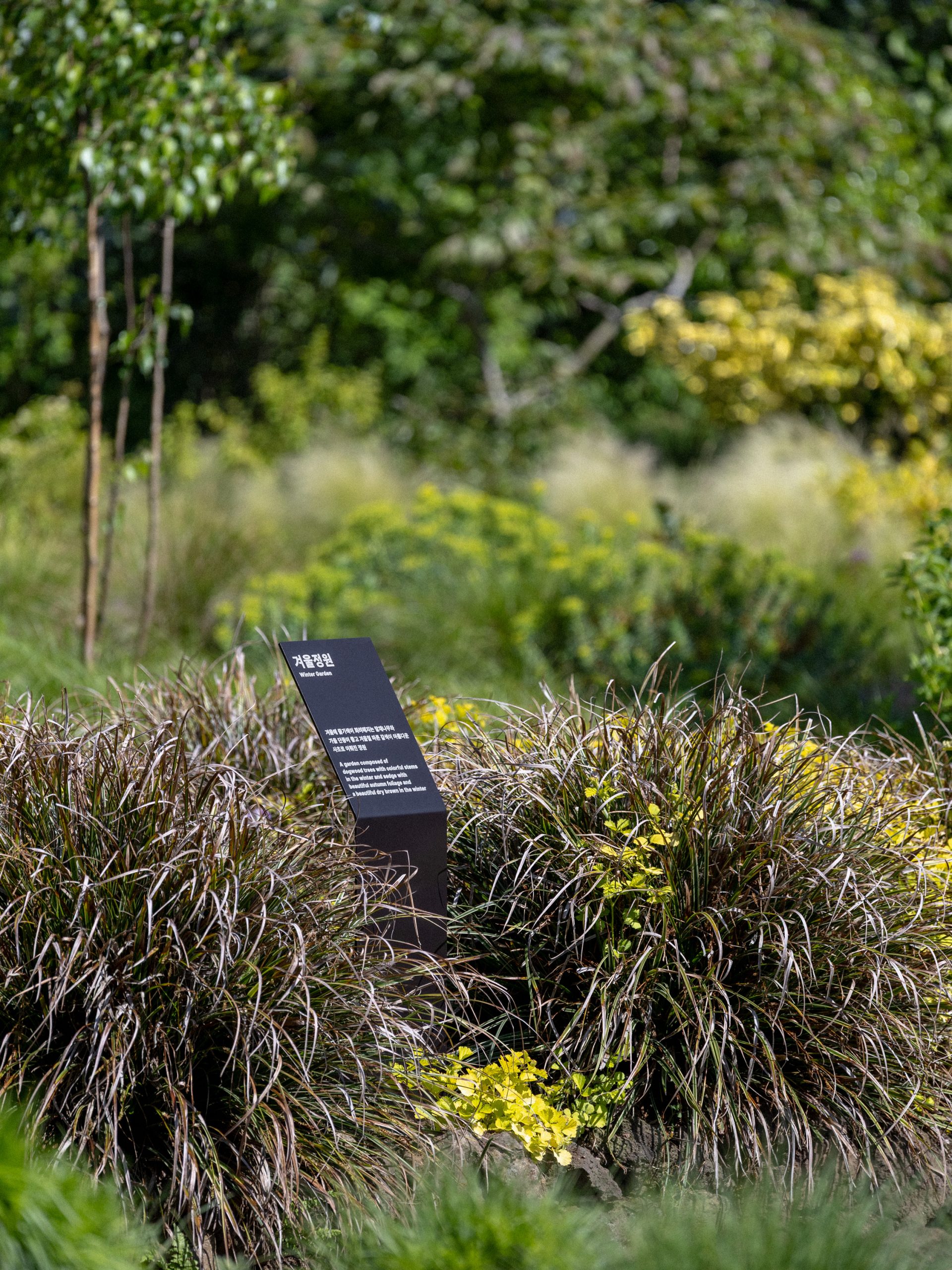
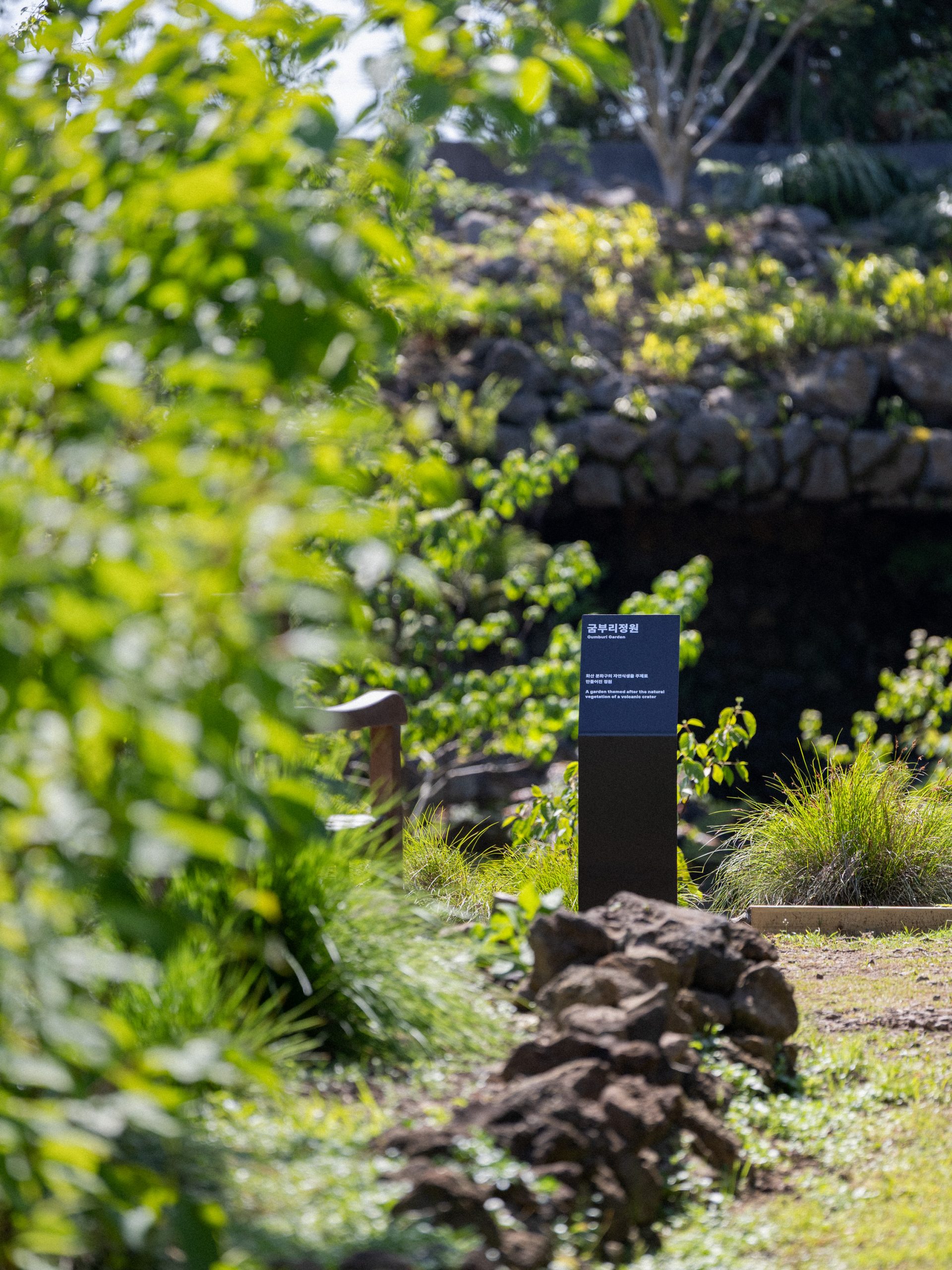
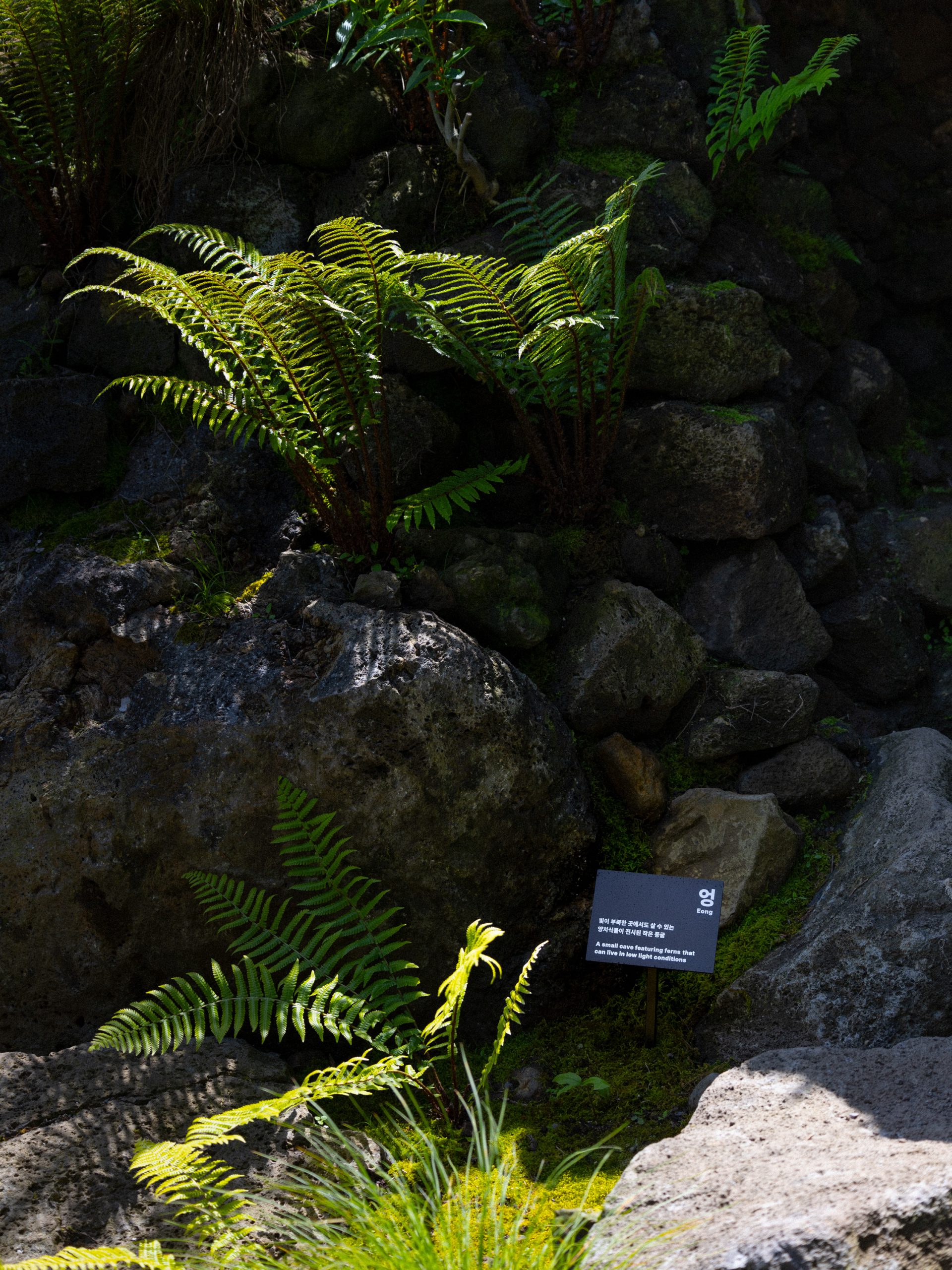
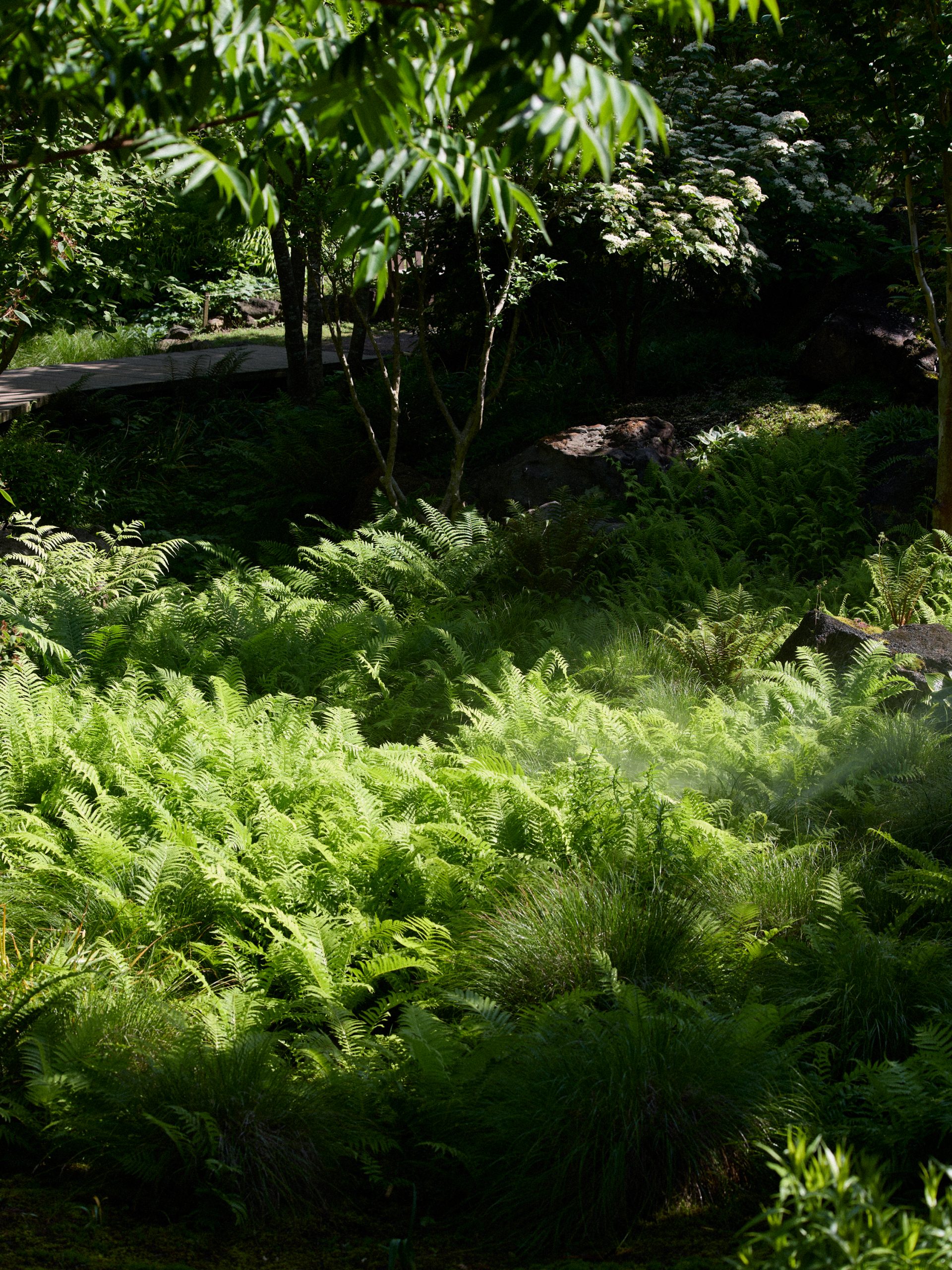
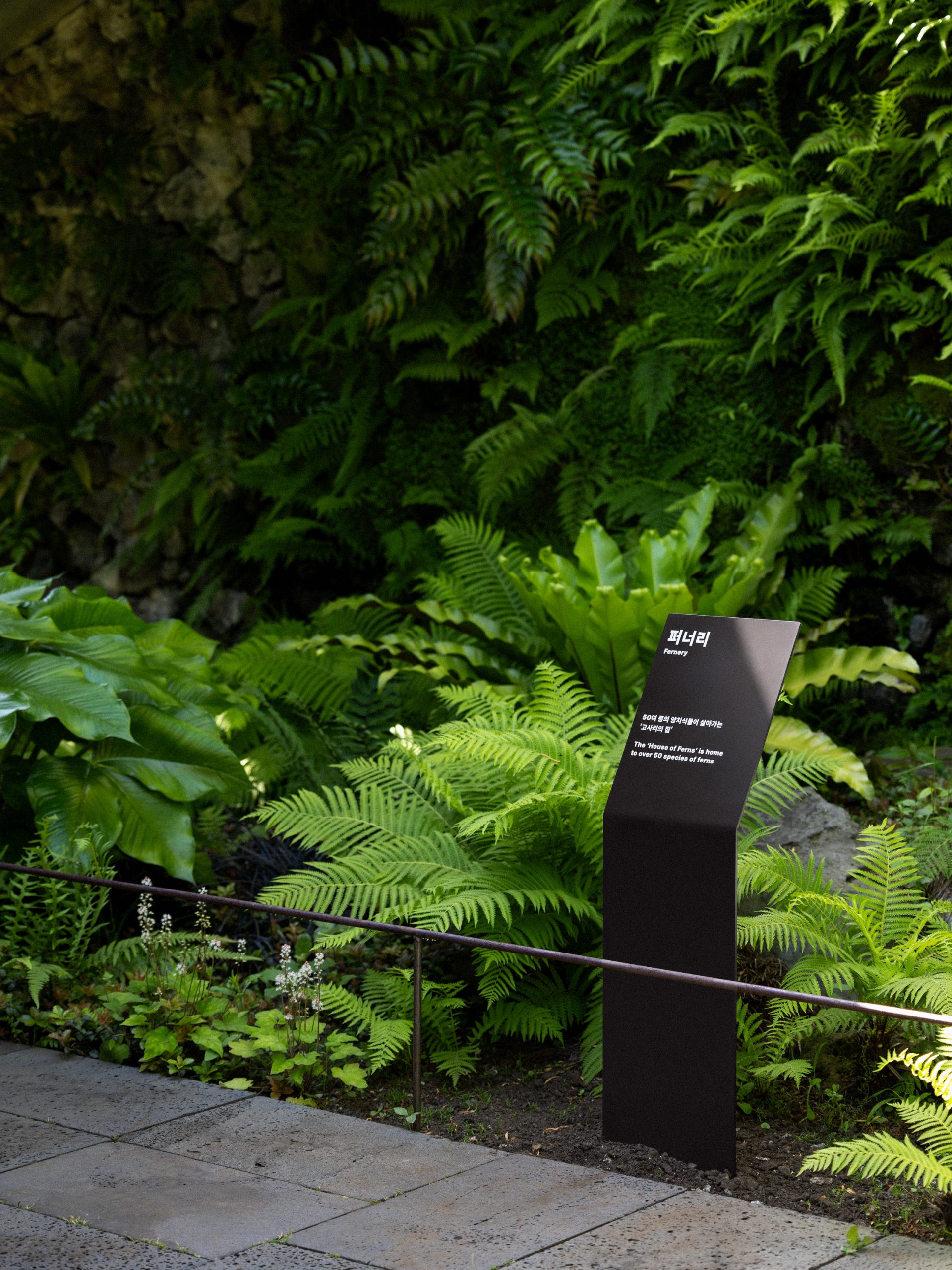
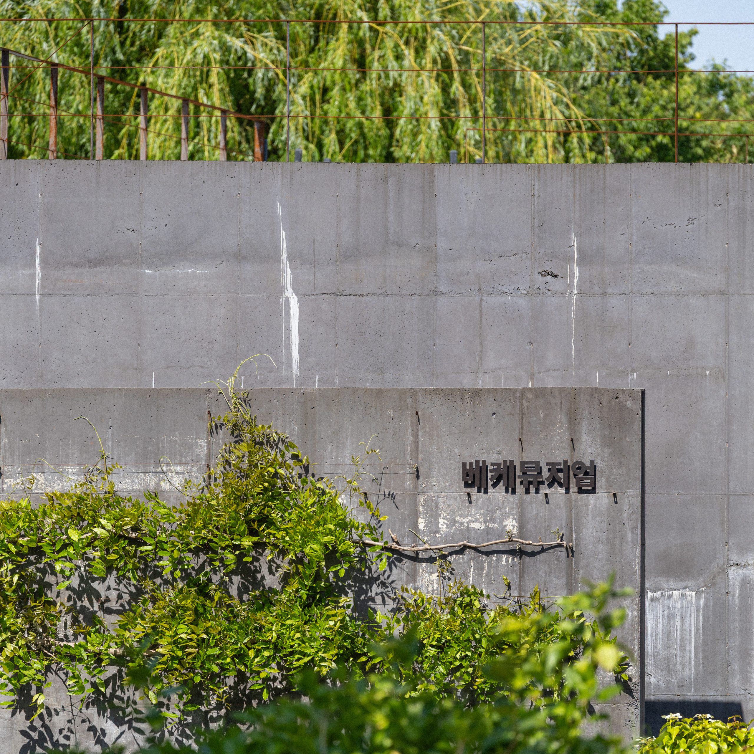
Veke is a naturalistic garden in Jeju. Chuigraf developed its brand identity by drawing from the site’s history and the Jeju dialect word “Veke,” which refers to a rough heap of stones marking the edge of a field. Once a tangerine orchard, the site still holds traces of these stone mounds. Inspired by this, Chuigraf designed a symbol reflecting stones, stone walls, and natural forms. The wordmark reinterprets the shape of the original driftwood sign. Brand collateral — including signage and printed materials — was kept minimal to blend naturally with the ever-changing beauty of Veke.
‘베케(Veke)’는 제주도에 자리한 자연주의 정원입니다. 취그라프는 이곳의 역사와 제주 방언에서 유래한 이름에서 영감을 받아 브랜드 아이덴티티를 디자인했습니다. ‘베케’는 밭의 경계에 아무렇게나 두텁게 쌓아놓은 돌무더기를 뜻하는 제주 방언에서 유래한 이름입니다. 원래 감귤 농장이었던 이곳에는 돌담처럼 보이는 돌무더기, 즉 베케의 흔적이 남아 있습니다. 취그라프는 이 이름의 의미를 살려, 돌과 돌담, 그리고 자연스러움을 모티프로 심벌을 디자인했습니다. 바다에 떠다니던 나무를 주워 만든 기존 간판의 형태를 다듬어 워드마크로 완성했으며, 사이니지와 애플리케이션은 최대한 단순하게 디자인하여, 계절과 시간에 따라 다양한 빛깔을 띠는 베케의 아름다움에 자연스럽게 스며들도록 했습니다.
Veke
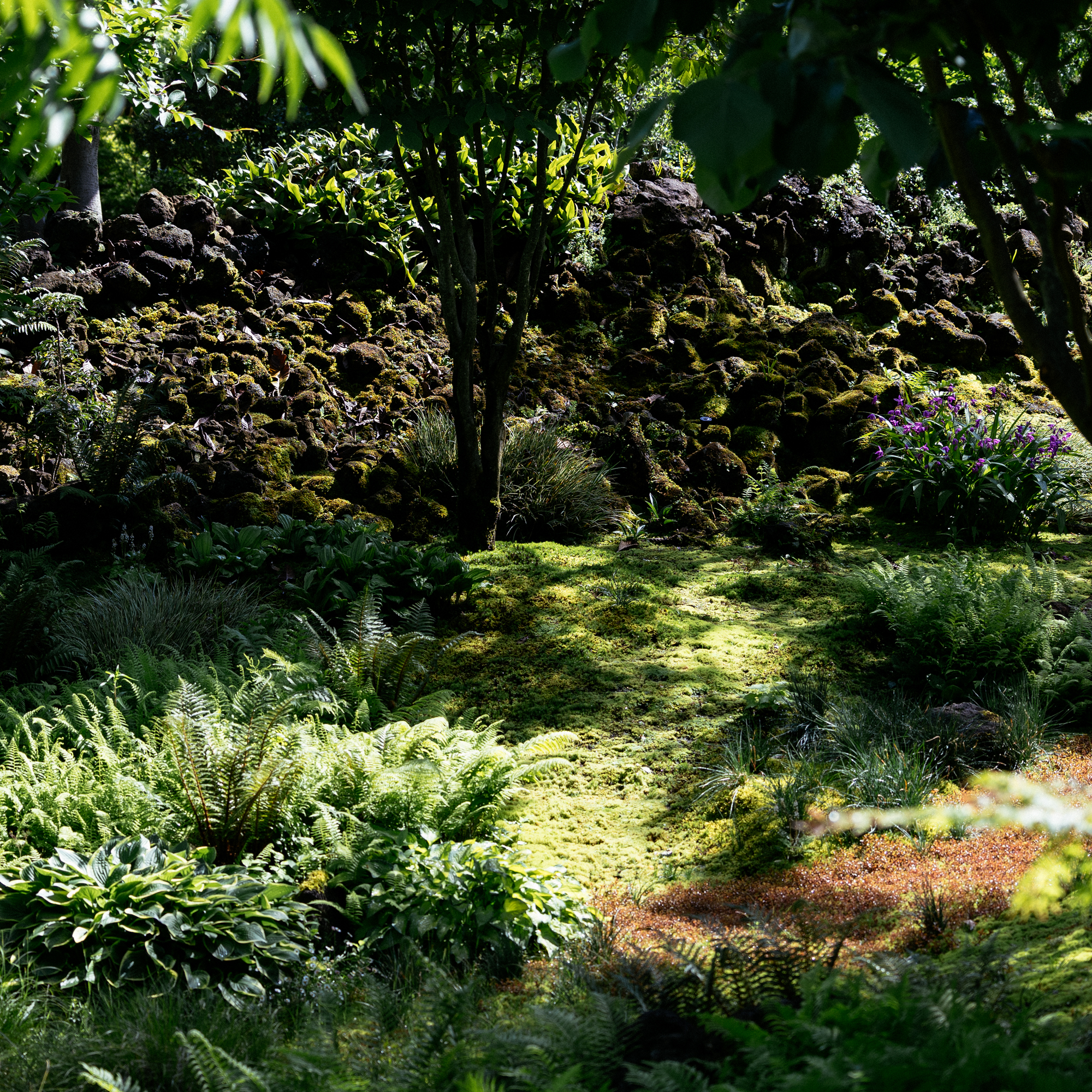
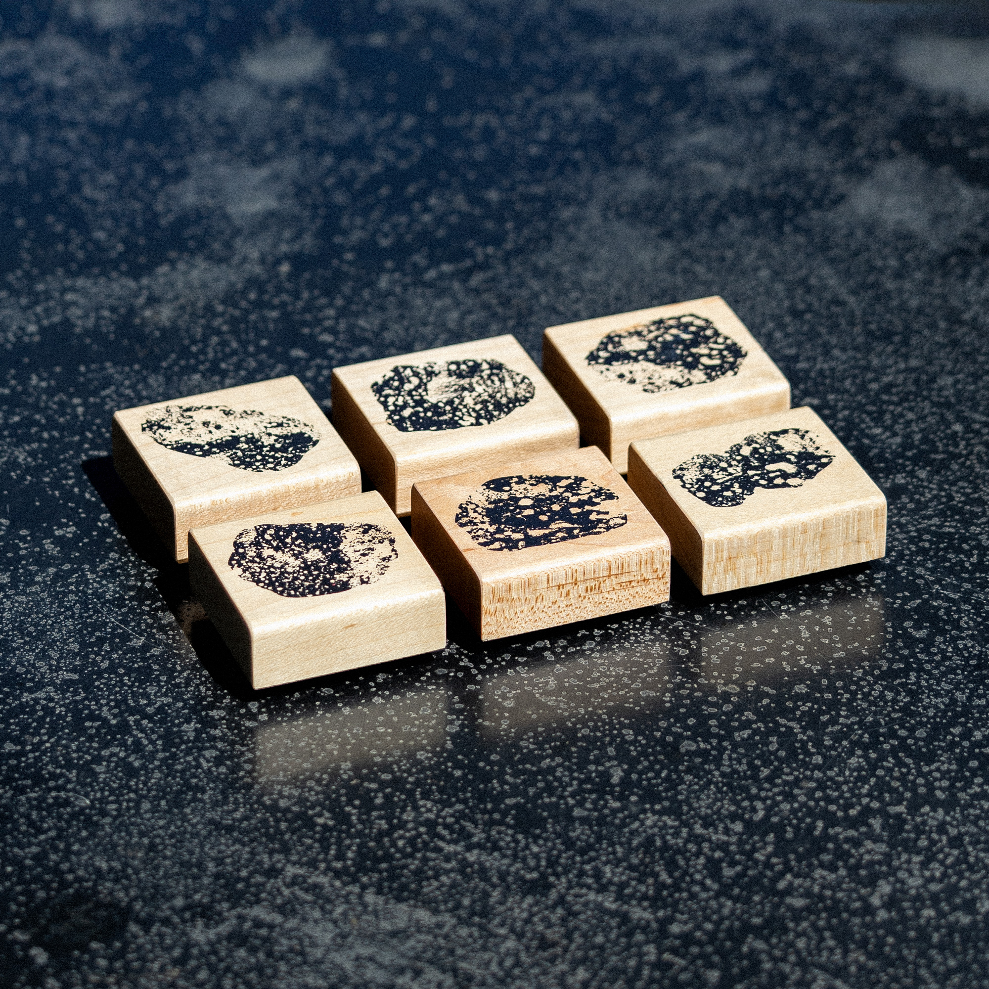
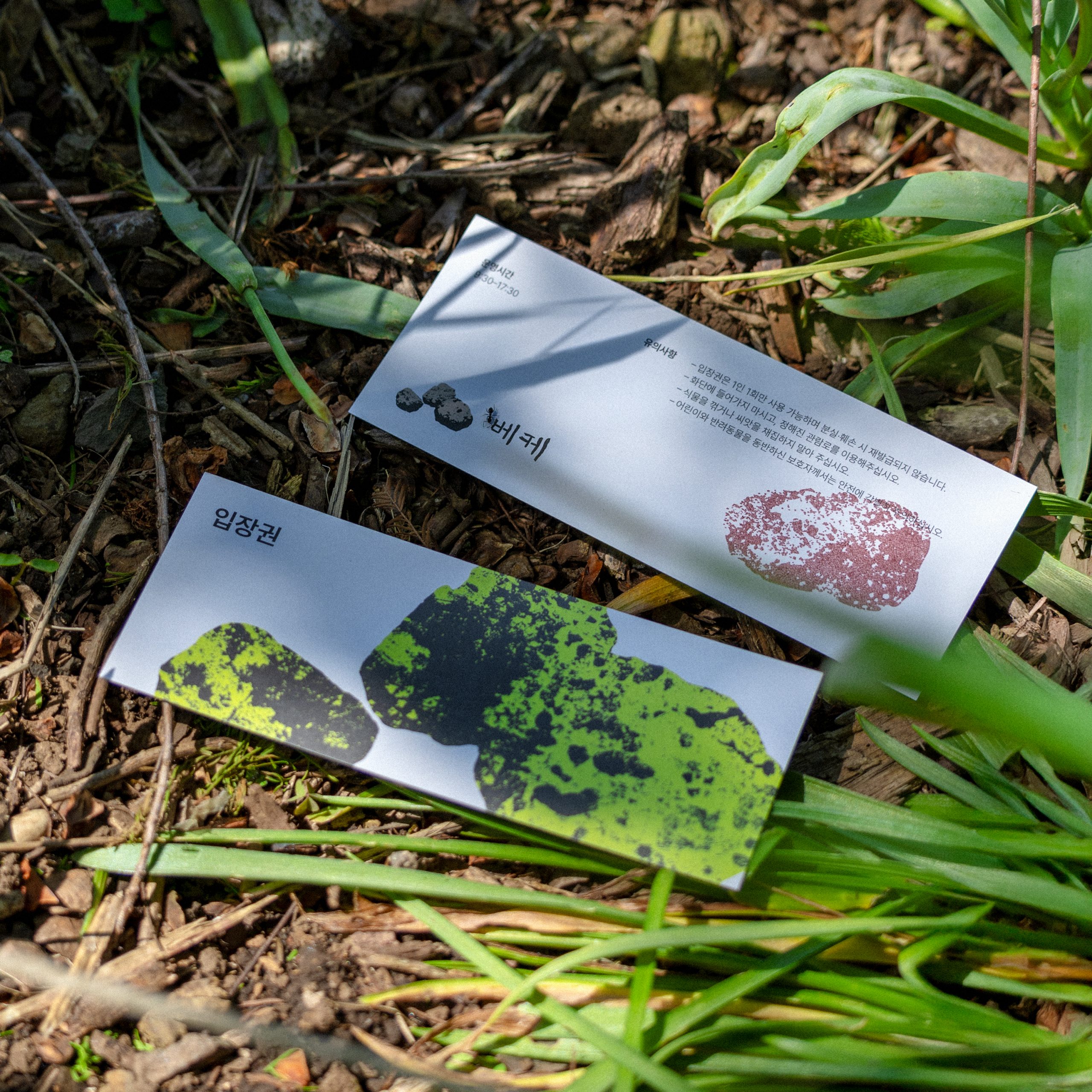
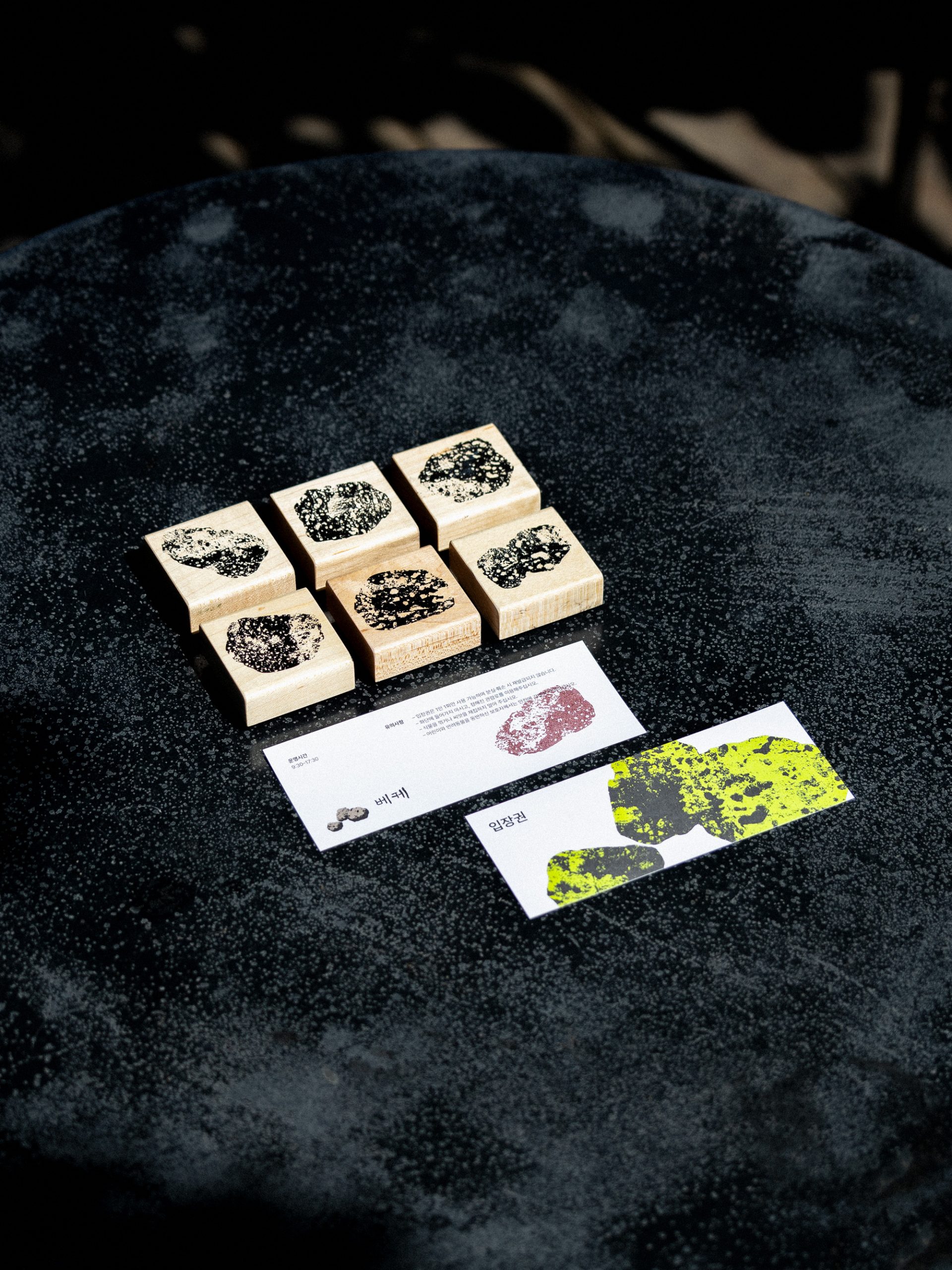
Veke — Traces of stone mounds from a former tangerine orchard; a rough heap of stones marking the edge of a field
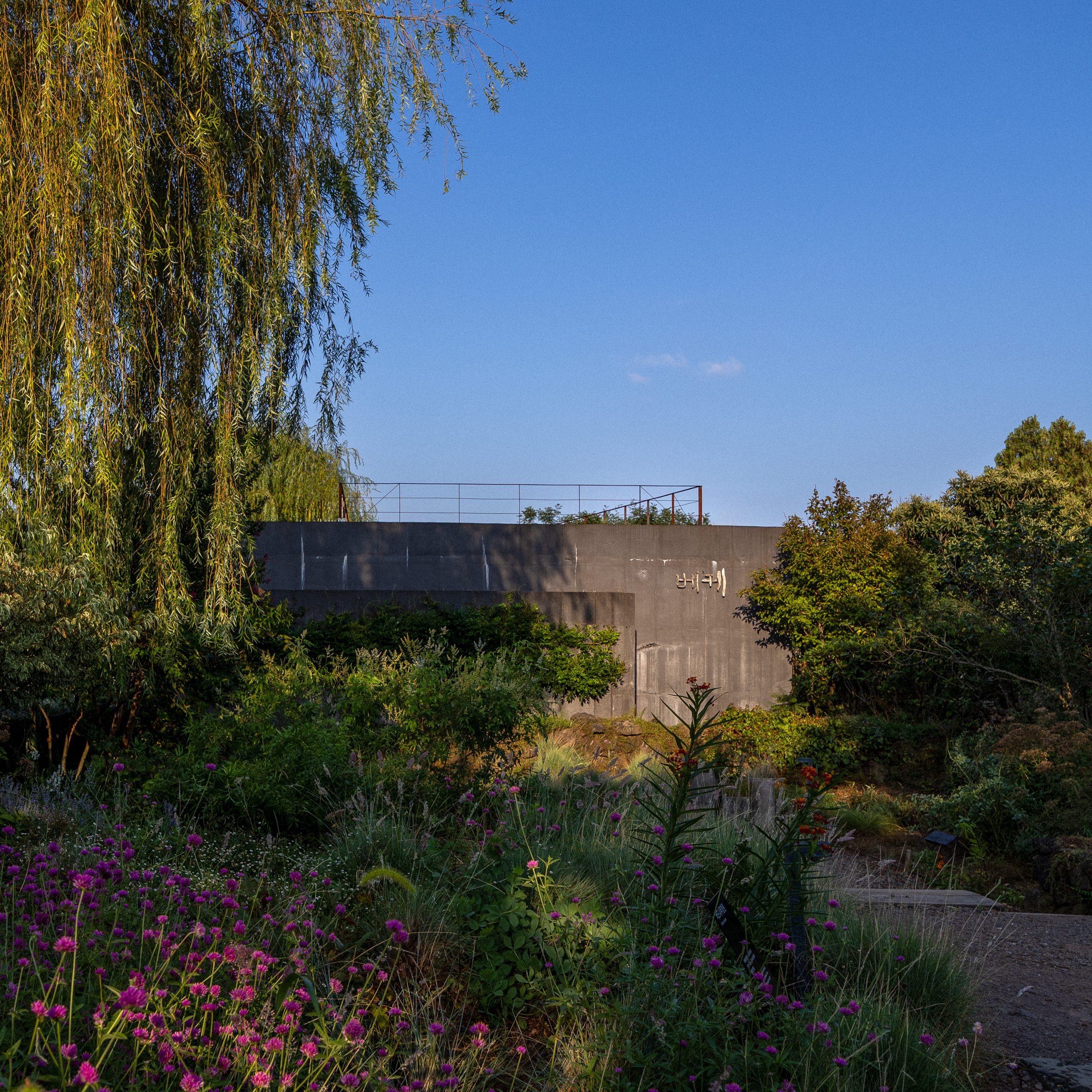
The original sign — driftwood found by the sea, weathered by nature
Primary logo
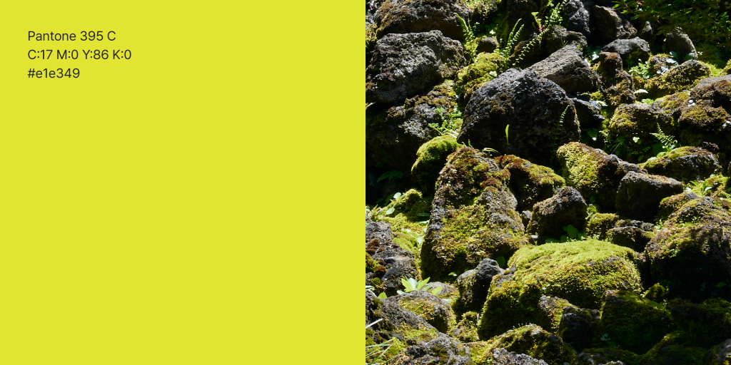
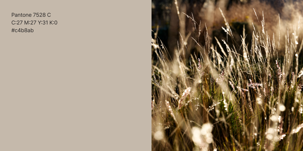
Primary color


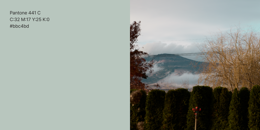
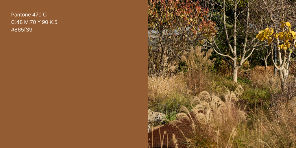
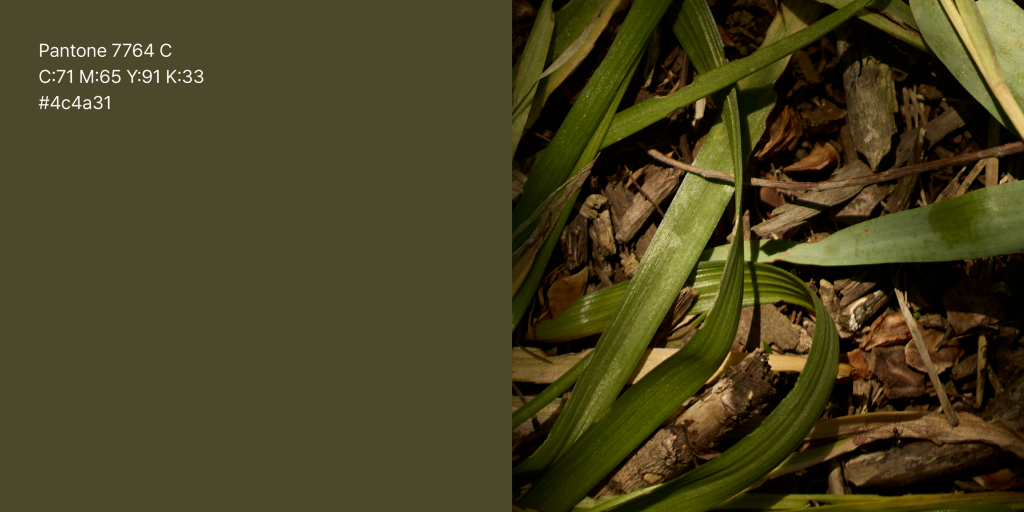
Secondary color

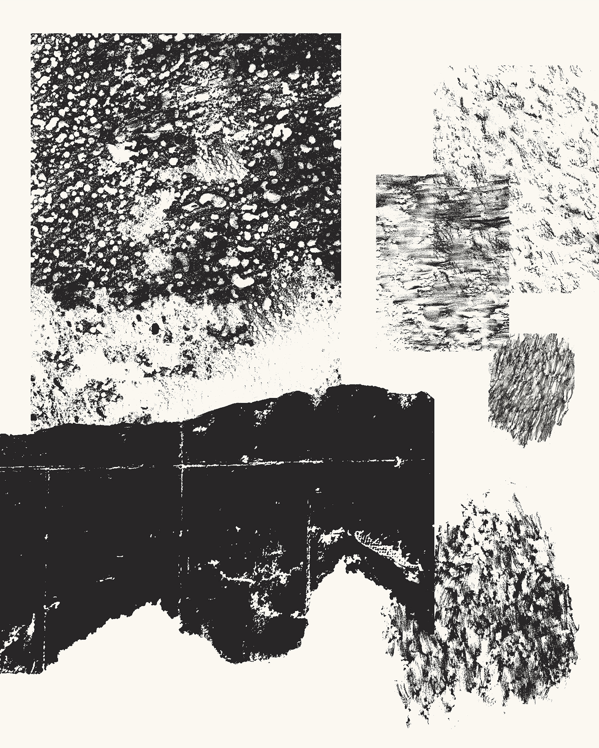
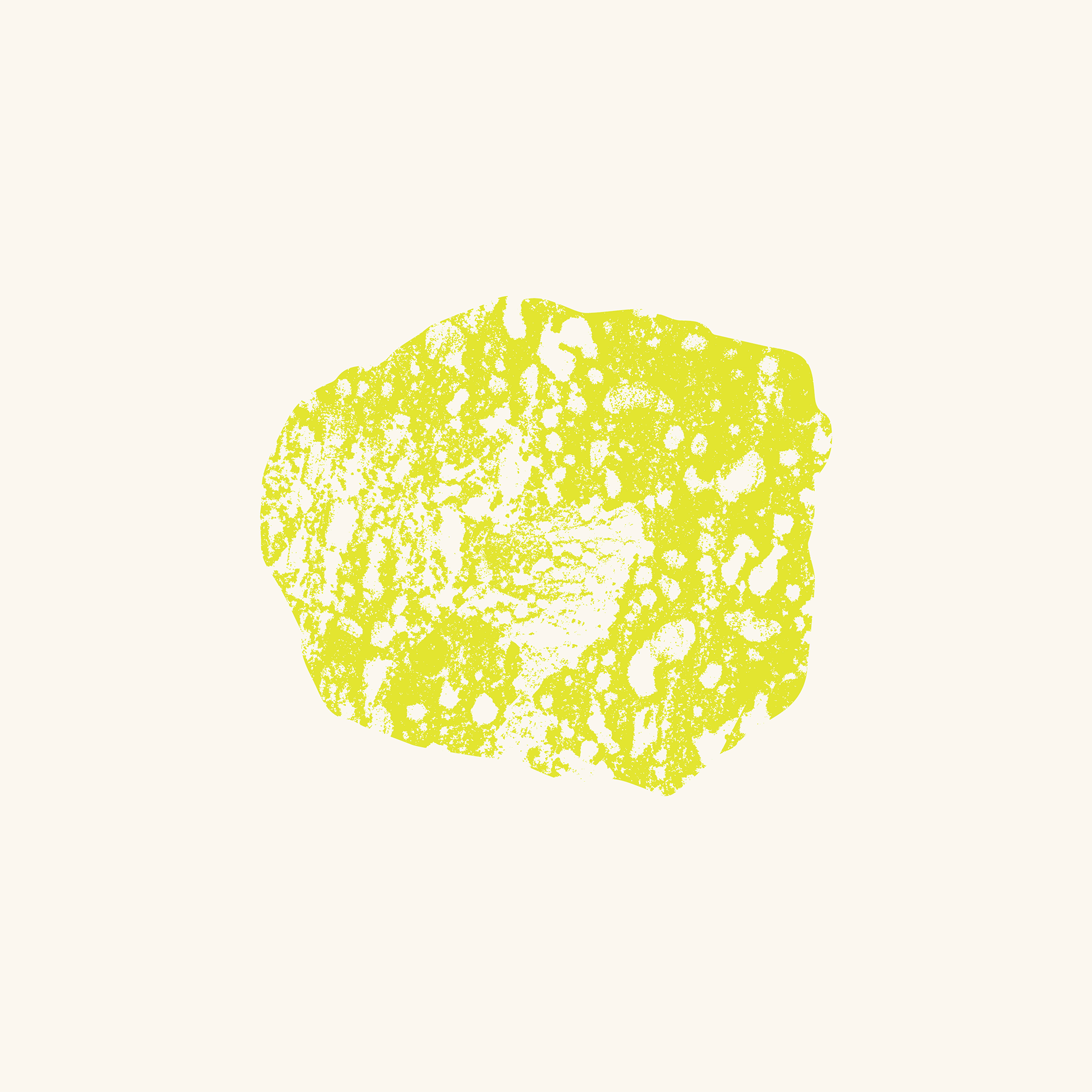
Texture & graphic motif
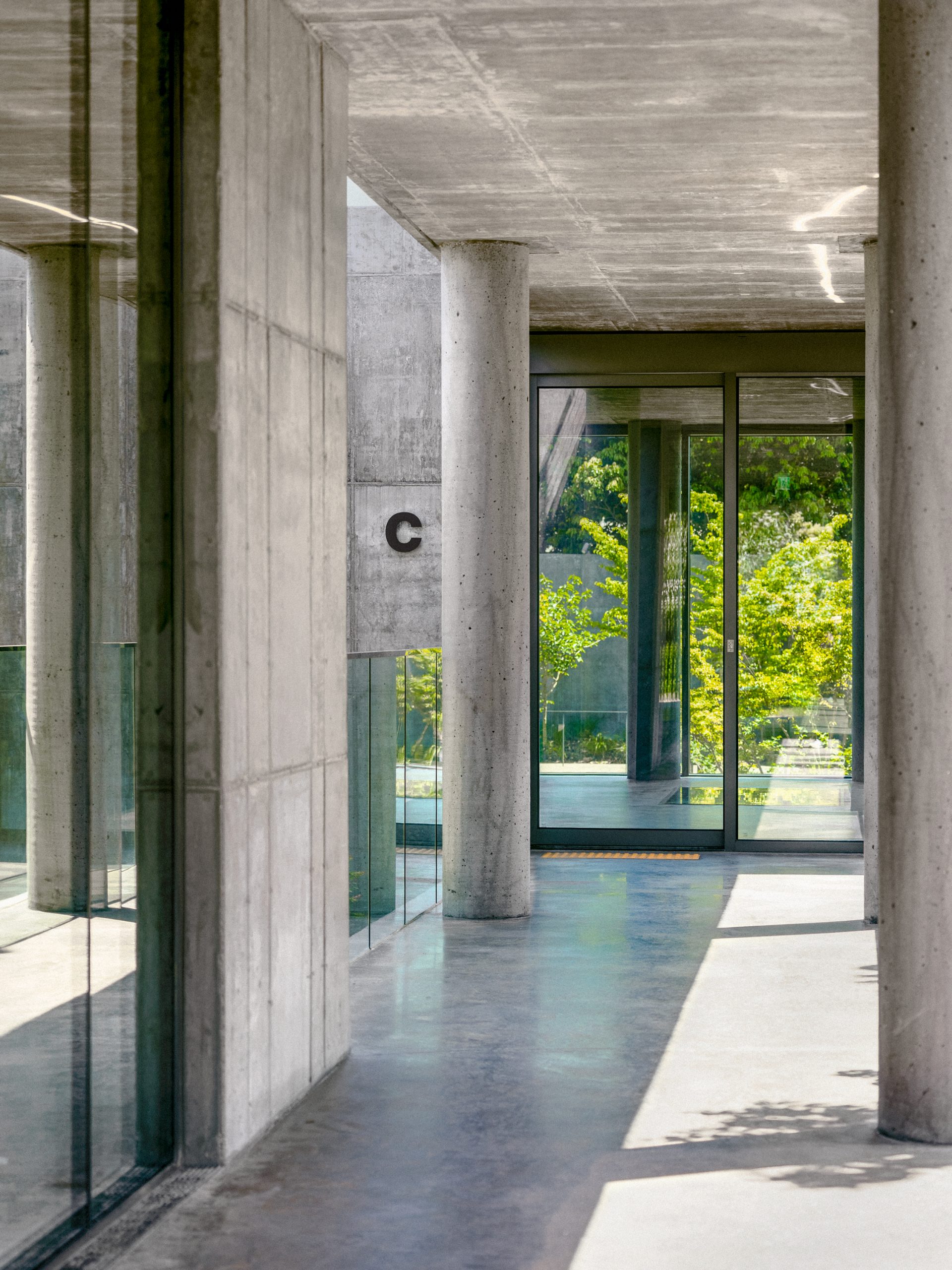
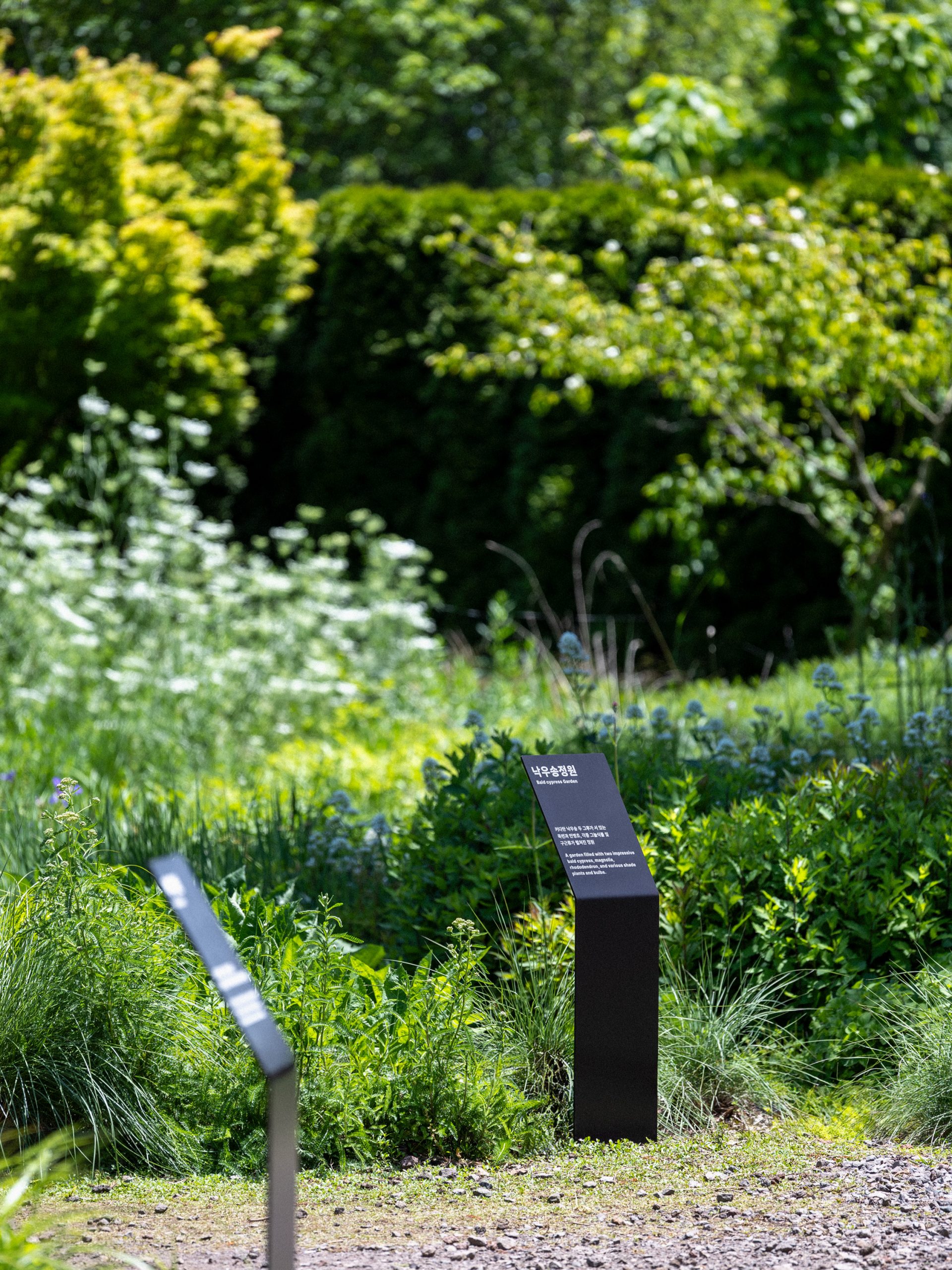
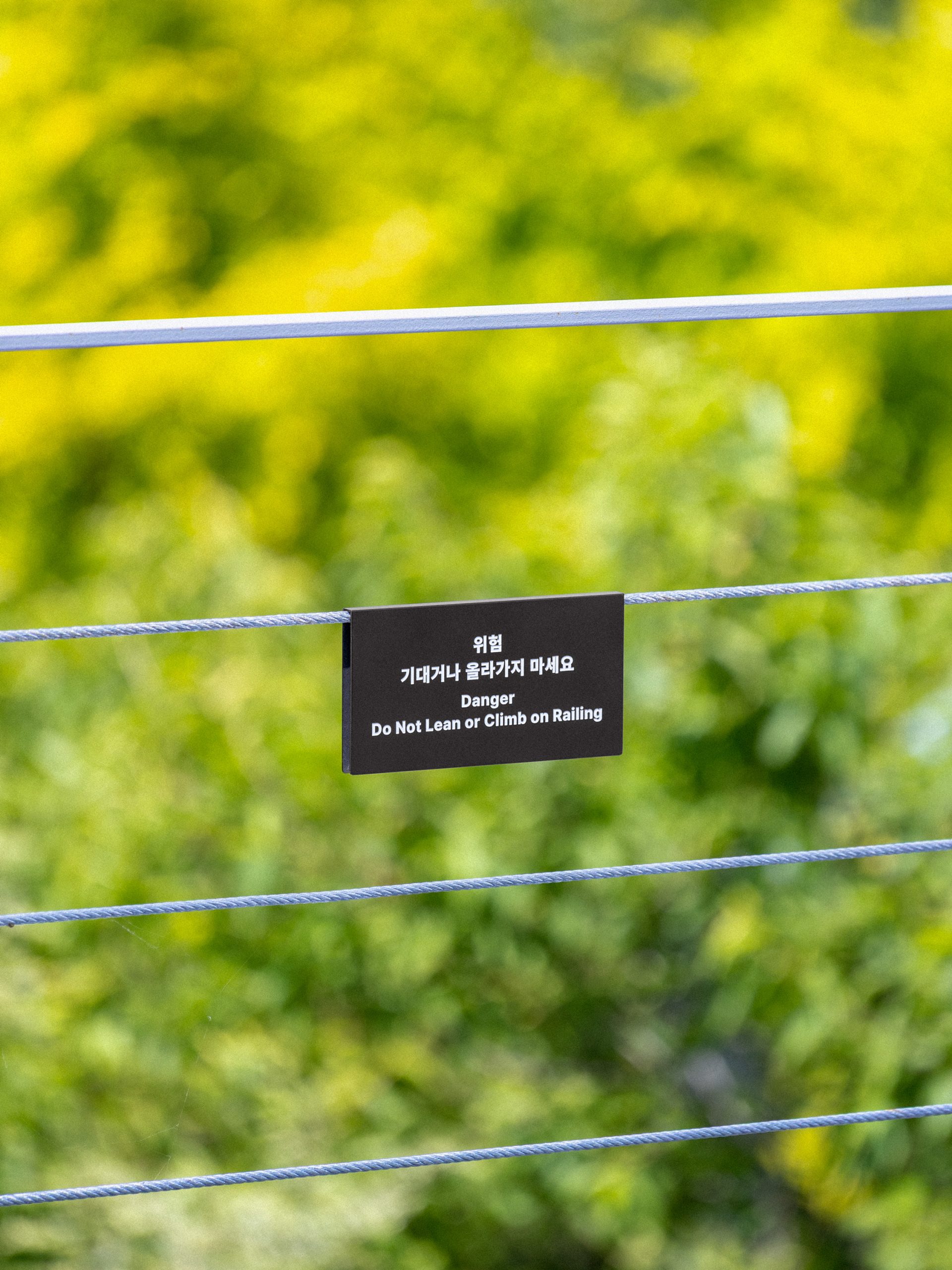
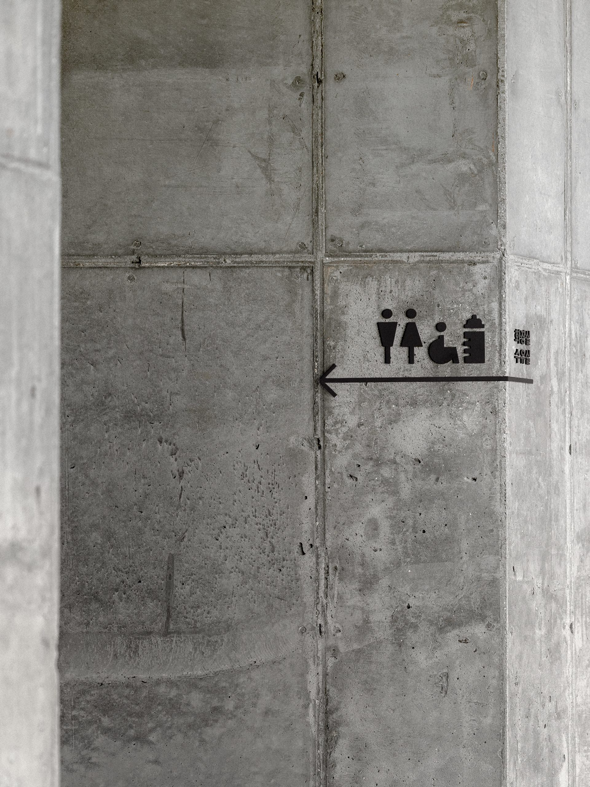
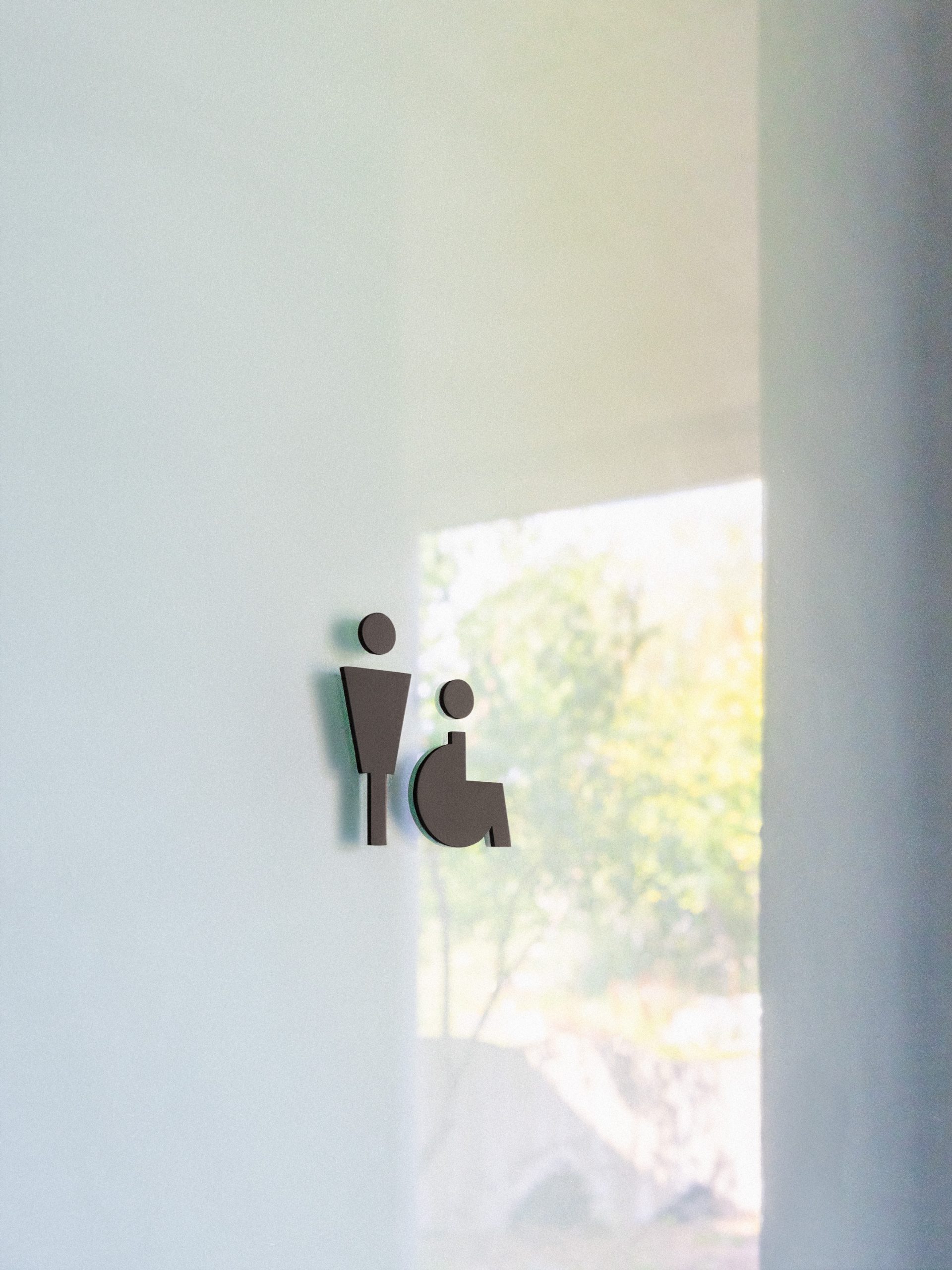
Signage


Brand collateral